Puzzle UI Work In Progress

Puzzle Options

I’m working on a new puzzle game for touchscreen devices!

The screen above is a mockup of the latest puzzle options screen. This UI will slide out over your selected puzzle image (chosen on the previous “puzzle select” screen.) Here’s how it works:

The Background tile is touchable and will toggle between showing or hiding the pattern background.

  • When the pattern is turned off, the player will be able to see the puzzle image underneath the piece slots. This makes the game much easier.
  • When the pattern is turned on, the puzzle is hidden (you cannot see the puzzle under the piece slots) so you must rely on shape recognition or memory to figure out where each piece goes.

The Outline tile toggles between showing or hiding an outline of the piece slots.

  • If turned on, the player can see an outline of each piece in the puzzle, making it easier to identify and match the piece to its slot.
  • When off, there are no outlines for slots-more difficult.

The pieces slider lets you choose more or less pieces for the puzzle. By default, it’s set to 6 pieces (for kids.) It can be decreased to 4 and increased to 24.

The play button starts the puzzle!

The back button in the upper left takes you back to the puzzle select screen where you can choose a different puzzle.

This is the current project. If you’re interested in this or our other kids apps, like Eggroll Games on Facebook or follow us on Twitter for updates.

Tappy Lander Dev Diary #4: Control

I love the mechanics of lander games and the fun, to me, is maneuvering your rocket through a series of subtle movements into a good position and a soft landing. It’s difficult but rewarding.

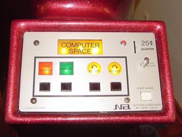
Traditionally these types of games had a variety of buttons: rotate, left, rotate right, thrust, etc.

Image

However, on the target devices I have one button, the touch screen; and I refuse to clutter the screen with complex controls just so it plays exactly like the originals (see my last post about UI.)

In order to simplify, I ask my favorite question: “What makes it fun?” and my cat looks at me like “Who are you talking to?!”

What I came up with…

  • Gravity – yes, still fun after all these years!
  • Rotating – a little frustrating to manage and even time consuming
  • Thrusting – absolutely, compensating for a force like gravity or your last thrust, in order to change direction, is fun.
  • Managing fuel – no way, maybe its just me, but I don’t like time limits. I don’t want to tell a player “You know this fun little playground I made?, well you can only play here for THIS long.”
  • Avoiding an obstacle or flying to collect an object – yes! an opportunity to test your flying skill.
  • Landing – yes, slow down and center yourself over the target for a soft, safe landing.

The Redesign

I immediately wanted to remove the fuel consumption issue. This is in essence, a time limit. It makes sense for quarter munching coin-ops, but doesn’t in a free mobile game. The gameplay is not made more fun by adding a time limit and removing it allows you to focus on manuvering even if you need to take your time.

Most classic gravity and lander games allow you to rotate your ship so that you can thrust in any direction. Again, this is something that I felt I could remove. With a simple up, left or right control scheme, I can move in any direction by timing my taps (except down, and gravity takes care of that.)

A Prototype

The prototype allowed me full control over my ship and maintained the fun of using your skill and instinct to manage the physics of flying through space. It was fun but simple; easier for general audiences to pick up and play but very challenging at the same time.

…and so I moved ahead with development! The next post will be about game physics.

Thanks for reading and be sure to like and follow Tappy Lander on Facebook and Twitter for daily updates.


Tappy Lander Dev Diary #3: UI

Because I had worked out the controls before putting pencil to paper, the gameplay UI has not changed much throughout production.

Tap left, up or right to thrust left, up or right

Sketch vs. final

The center circular button has been replaced with a thumb-shaped button because the controls need to bleed off the bottom of the screen to accommodate lots of different screen sizes. Also, there is no space between or around the buttons that allow you to see the background. Although the sketch suggests this, I felt it would be distracting. The control panel must feel like it is separated from the game completely. In fact, the top of the control panel acts like the bottom of the game screen. Other than that, the final is nearly identical to the sketch.

80s arcade control panels = good touchscreen design

Like a classic coin-op arcade game, the control panel was to be at the bottom with the viewscreen above them. Vision-obscuring on-screen controls for touch interface games is a pet peeve of mine and this layout would ensure that no thumbs or fingers ever get in the way of the action.

Don’t look down

The touch area for the three buttons extend all the way to the top of the screen and they are as wide as possible. The width and position of the buttons mean that you can control the game without looking at the buttons, removing the no-tactile-button problem which is a common stumbling block when making traditional games for touchscreen interfaces. The center button is skinnier than the others because you use the left and right buttons more frequently than the up thrust.

That’s all for the gameplay UI. Next time we’ll probably discuss the actual gameplay control experience.

Thanks for reading and be sure to like and follow Tappy Lander on Facebook and Twitter for daily updates.